
The first article about Google Data Studio reports you can find on the link. There we talked about the first steps on the platform. In this article there is more information about report style in Google Data Studio and report-level elements.
Determinate report styles in Google Data Studio
Google has interactive introduction course of Google Data Studio. This course gives a good overview about the platform’s facilities. I suggest you to complete this course and in this article, I just mark some moments, that I’ve found interesting myself.
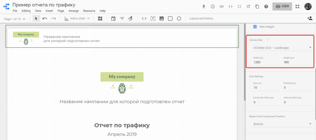
Let’s start from the cover page. First what we choose – is canvas size, default page size. If you plan to print your report, it’s better to choose A4 (210×297 mm), if you show it on the screen of a laptop, for example, – choose a landscape standard page as in Microsoft Powerpoint, for example 1200×900 px.
When you don’t choose any objects, you can find a Layout and Theme panel on the right of your screen. Scroll it till you see the block Canvas Size and choose which one is fit your task.
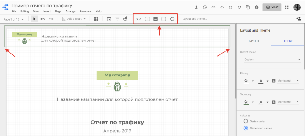
Then go to the tab Theme and setup basic colors, font and other settings of your report. It makes your life easier! For example, when you draw a rectangle it will be the theme color, that you have setup. Also if you change the color in the Theme tab later, all the elements where you are using default color will change. Try it, it’s really convenient.
I can give you some advice that I like to use. Font type – Montserrat, because it is just light sans serif font and Cyrillic letters look nice. I prefer to choose colors from client logo and website and others that combine. For your own report you can take colors from your brand book. If you are new on this topic, I recommend to read the article about color wheel.
Report-level objects
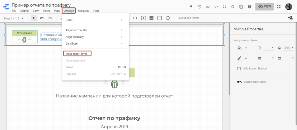
Google Data Studio allows to create page-level and report-level objects. If you choose report-level, this object will be on the same position on all pages.
In my templates, I would like to use next elements to the header: logotype, client name and report data (a previous month). Also, I like to underline it all off with a thin line.
For now (May 2019) we don’t have a line as an object in Google Data Studio, and I just draw a rectangle without any background but with 2px border and make it a bit bigger than a page. On view mode you will see it only on the page details.
I draw a rectangle, add a logotype, write a client name, add a data range. If a company name is easy to read in logo, then I don’t add it again in additional text. Select all header elements and on the Arrange top menu click Make report-level.
From this moment our header will be on all the report pages.
Apart, I will add report-level footer with information about me, as a report creator.
We can’t use automate page numbers unfortunately. If you need this element you can just add a basic text element with numbers manually.
On the cover page I use a client company name, a logo, a report name and a report period if required.
Go ahead, create a new page through Page top menu or through submenu Page on the left page screen and go there.
Date range
On the top right corner of my screenshot you can see a date field. All dashboards on current page will use this date as a dashboard date if not otherwise specified.
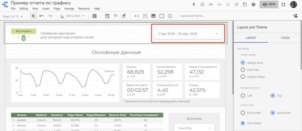
By default, all dashboards on the page will use this date range, but if you need to setup some specific date for a table or a chart, you should go to this chart settings and change a date from auto to custom. On that block you can choose comparison date range if required.
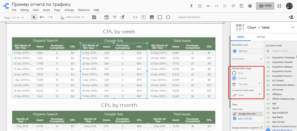
You can find example on 7th page of my sample. There I want to share information about CPL by weeks and months. If you remember, a main date range in my templates – the previous month, so I just setup custom dates for these chats.
Work with filters in Google Date Studio
As we are already on the 7th page, I will tell you how I show a data from different channels separately. If you scroll right panel till almost the end, you will find filters block, where you can identify data for this current chart.
Google Ads traffic I choose as Source = Google and Medium = cpc or display.
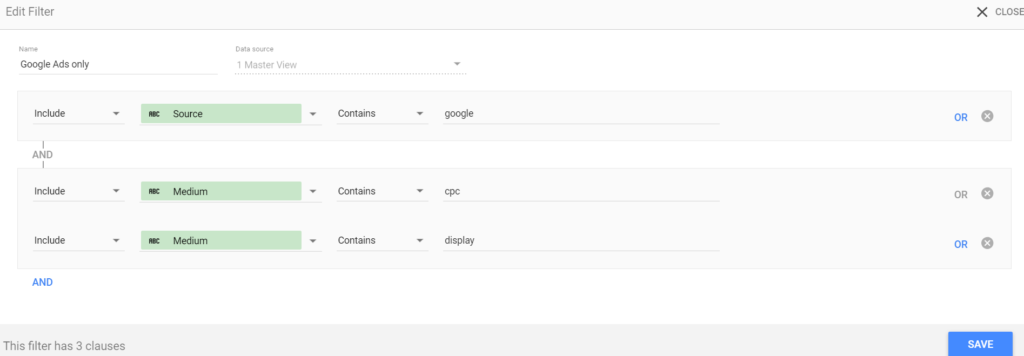
For sample in the report I use a data from demo Google Analytics account, where there is no data from Yandex Direct. But in the beginning my report included breakdowns: Yandex Direct, Google Ads, Total leads.
I left Yandex Direct filters in the templates, you can find it in the filters and use, if you need.
***
In the first part of this block of articles I talked about registration and the first steps on the platform Google Data Studio. You can find this article on the link.
In the the following part we will talk about my sample report page by page. The link is here.